« Креативная страница с ошибкой 404, с адаптацией на чистом CSS »
Описание материала:
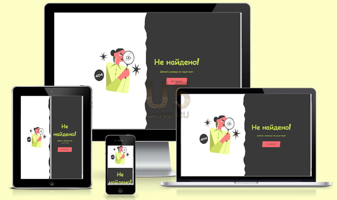
Представляем вашему вниманию креативную страницу с ошибкой 404. Данная страница полностью адаптированна под планшеты и смартфоны. Сделана она с помощью CSS стилей и HTML кода. Так же на нашем сайте, вы сможете найти данные страницы, просто перейдите по данной ссылке, и вы увидите список материалов со страницами 404.
HTML код:
Код
<div>
<aside><img src="https://s3-us-west-2.amazonaws.com/s.cdpn.io/4424790/Mirror.png" alt="404 Image" />
</aside>
<main>
<h1>Не найдено!</h1>
<p><em>Данной страницы не существует</em>
</p>
<button>На главную!</button>
</main>
</div>
<aside><img src="https://s3-us-west-2.amazonaws.com/s.cdpn.io/4424790/Mirror.png" alt="404 Image" />
</aside>
<main>
<h1>Не найдено!</h1>
<p><em>Данной страницы не существует</em>
</p>
<button>На главную!</button>
</main>
</div>
CSS код:
Код
@import url("https://fonts.googleapis.com/css2?family=Fontdiner+Swanky&family=Roboto:wght@500&display=swap");
* {
box-sizing: 0;
margin: 0;
padding: 0;
cursor: url("https://s3-us-west-2.amazonaws.com/s.cdpn.io/4424790/cursors-edge.png"),
auto;
}
body {
background: linear-gradient(to right, white 50%, #383838 50%);
font-family: "Roboto", sans-serif;
font-size: 18px;
font-weight: 500;
line-height: 1.5;
color: white;
}
div {
display: flex;
align-items: center;
height: 90vh;
max-width: 1000px;
width: calc(100% - 4rem);
margin: 0 auto;
}
div > * {
display: flex;
flex-flow: column;
align-items: center;
justify-content: center;
height: 100vh;
max-width: 500px;
width: 100%;
padding: 2.5rem;
}
aside {
background-image: url("https://s3-us-west-2.amazonaws.com/s.cdpn.io/4424790/right-edges.png");
background-position: top right;
background-repeat: no-repeat;
background-size: 25px 100%;
}
aside img {
display: block;
height: auto;
width: 100%;
}
main {
text-align: center;
}
main h1 {
font-family: "Fontdiner Swanky", cursive;
font-size: 4rem;
color: #c5dc50;
margin-bottom: 1rem;
}
main p {
margin-bottom: 2.5rem;
}
main p em {
font-style: italic;
color: #c5dc50;
}
main button {
font-family: "Fontdiner Swanky", cursive;
font-size: 1rem;
color: #383838;
border: none;
background-color: #f36a6f;
padding: 1rem 2.5rem;
transform: skew(-5deg);
transition: all 0.1s ease;
cursor: url("https://s3-us-west-2.amazonaws.com/s.cdpn.io/4424790/cursors-eye.png"),
auto;
}
main button:hover {
background-color: #c5dc50;
transform: scale(1.15);
}
@media (max-width: 700px) {
body {
background: #383838;
font-size: 16px;
}
div {
flex-flow: column;
}
div > * {
max-width: 700px;
height: 100%;
}
aside {
background-image: none;
background-color: white;
}
aside img {
max-width: 300px;
}
}
Демонстрация
Демонстративная страница или сайт материала
Установка материалаМы поможем установить данный материал к Вам на сайт
Добавил: YaVi | Категория: Меню и навигация | Просмотров: 785
Теги к материалу:
Поделиться в соц. сетях:
К данному материалу нет комментариев, но Вы можете стать первым, оставив свой комментарий!
Комментариев: 0
| |